@Hue & Cry
Ardbeg Committee

Task Summary
Brand identity and Key Visual for The Ardbeg Committee.
Brand Identity
-
Illustration
-
Brand Guidelines
-
Micro site
-
Brand Identity - Illustration - Brand Guidelines - Micro site -


Key Visual Creation
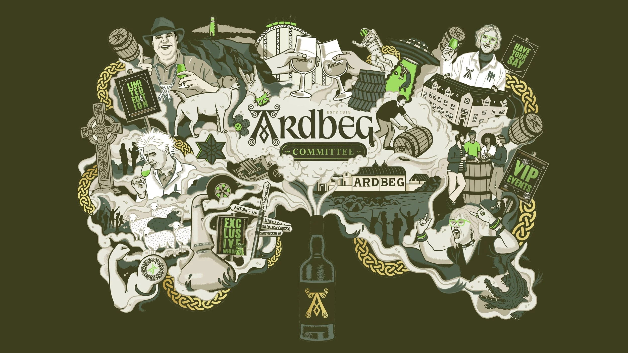
With the help of illustrator Justin Poulter, we created a Key Visual to use across multiple applications to communicate the ethos of the committee and ultimately forming a central part of the brand identity.
Under the concept of ‘Fellow Fanatics Unite’, The Key Visual is to be used as a battle cry that summons passionate enthusiasts from all walks of life to join our community. Celebrating the joy in our obsessions, embracing our eccentricities, and uniting in our bold, geeky freak-dom.
This illustration style showcases a maximalist celebration of all things Ardbeg, cascading from a central focal point, symbolically depicting a multitude of reasons why the Committee is a desirable and fun club to be part of.
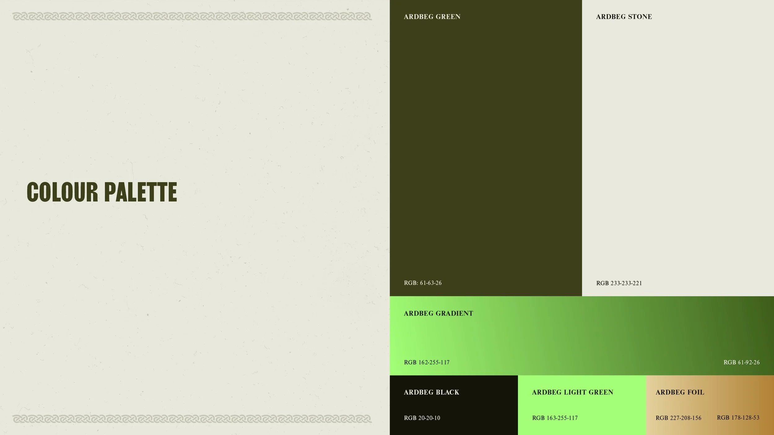
Under my direction Justin illustrates brand codes, visual representations of limited Arbeg bottles and diverse characters. I think it succeeds in reflecting Ardbeg’s quirky personality, whilst retaining an elevated and premium feel, through the use of a limited colour palette and modern, unexpected visual approach.

Branding
Since its creation to save the Ardbeg distillery from closure, the Ardbeg Committee has grown into one of the largest and most passionate fan groups in the world of whisky.
We were tasked with creating a consistent visual identity to unite all Committee communications. (Previously many of their communications had been adhoc and uncoordinated.) With a focus on growing the group, building engagement and deepening the connection between the Committee and the brand.
Ultimately, the Ardbeg Committee's branding should capture the essence of Ardbeg’s quirky personality and be reflected throughout the identity in an elevated and premium way.
The logo identity was created by stamping an additional mark to the Ardbeg logo. The key visual formed a central part of the brand so we use typography and parts of the illustration to create placards and stickers to be used as brand assets.


