@Daziel & Pow
Glo

Task Summary
Rebrand for dental care pioneers, Glo Science, looking to disrupt the market with a bold new strategy.
Brand Identity
-
Strategy
-
Packaging
-
Campaign
-
Brand Identity - Strategy - Packaging - Campaign -
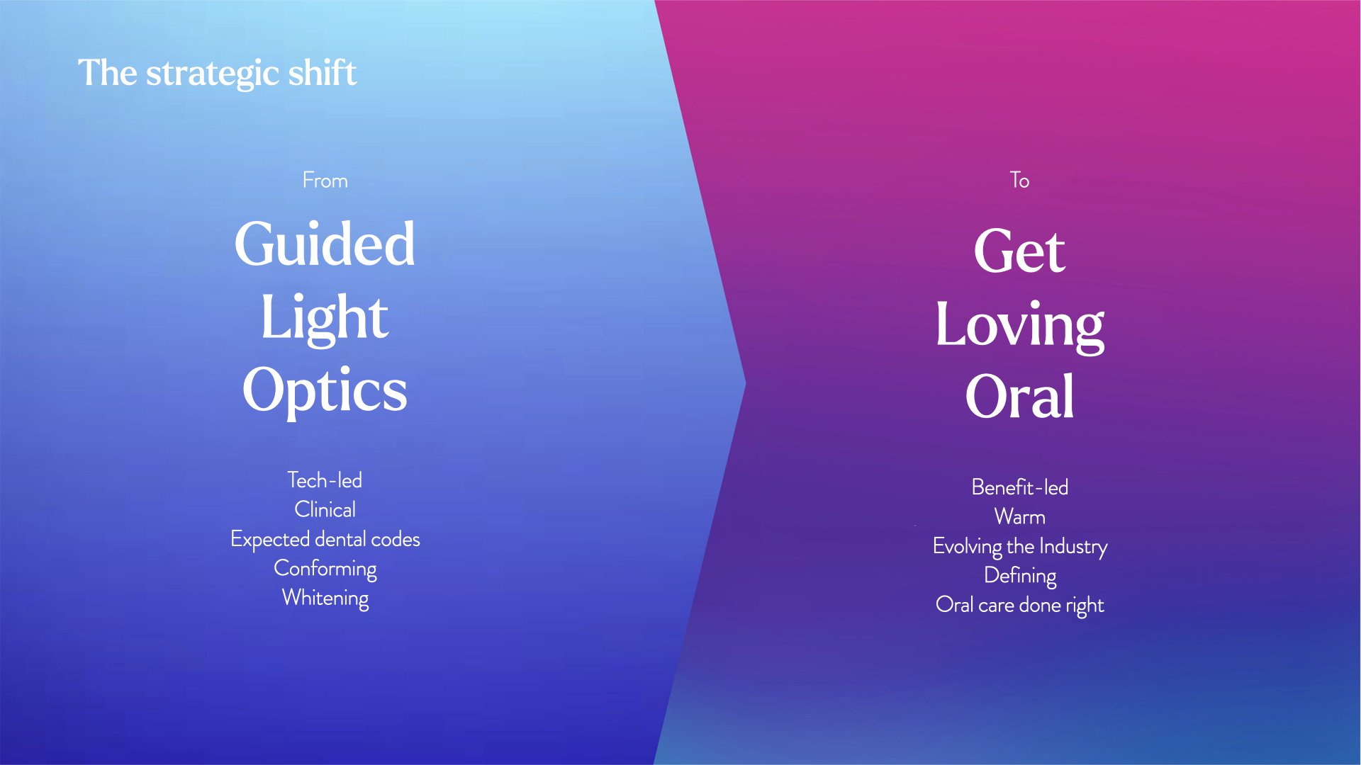
Owning total oral health.
Glo Science are an established trusted brand in the oral health care market. Their clients are primarily dentists (B2B), but they wanted to build on their consumer facing teeth whitning products and build a brand that had more personality.
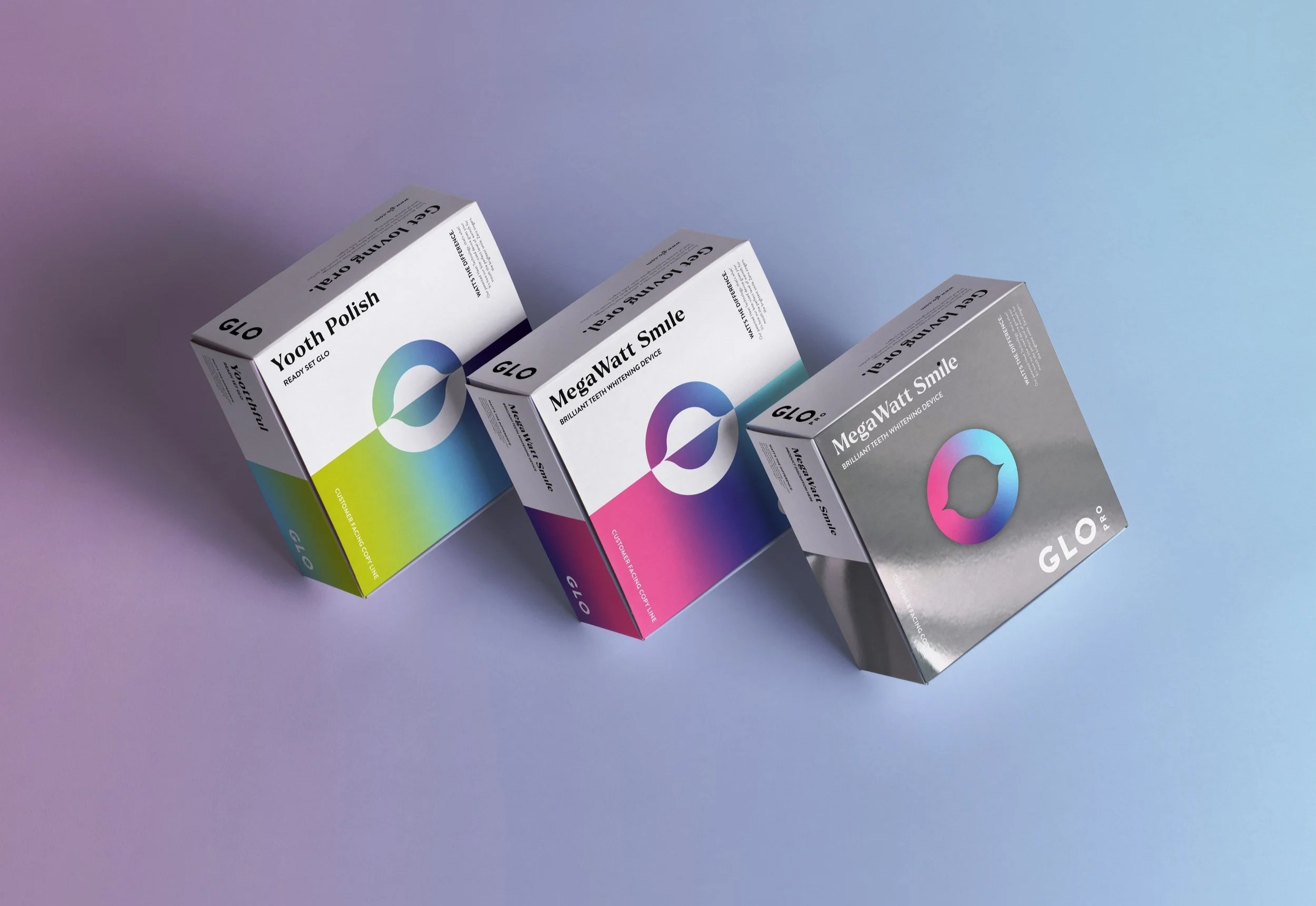
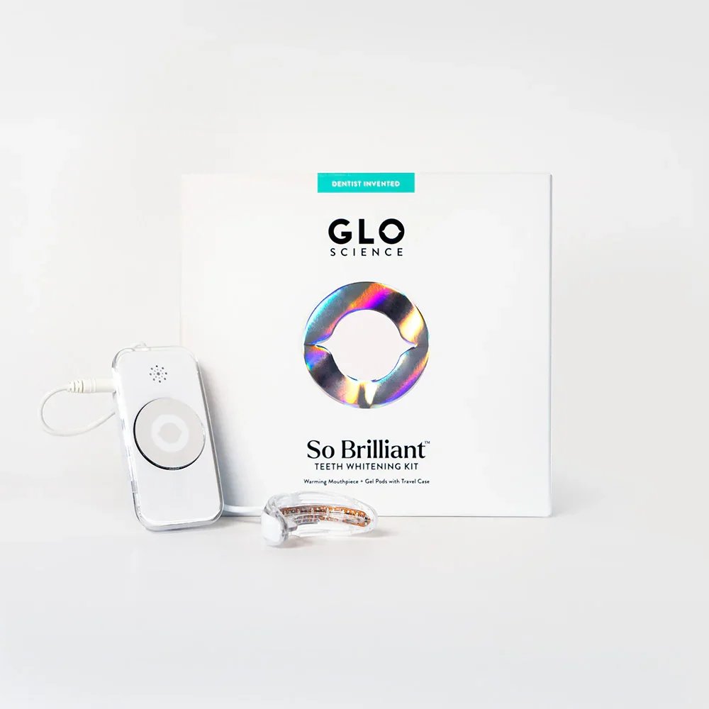
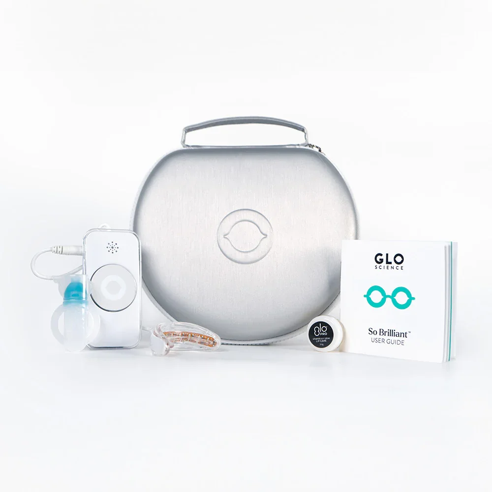
Working together with Glo we wanted to disrupt the market, thats a sea of smiles and cold white pharmaceutical packaging and create a brand that is bold,, confident and energetic, whilst still being represented of Glos patented thermo science.
To achieve this we combined witty copy lines with engaging visuals and thermographic packaging. The logomark is bold whilst being minimal to flex for a variety of settings. It's inspired by owning the ‘o’ and total oral health.


There’s motion in the glotion
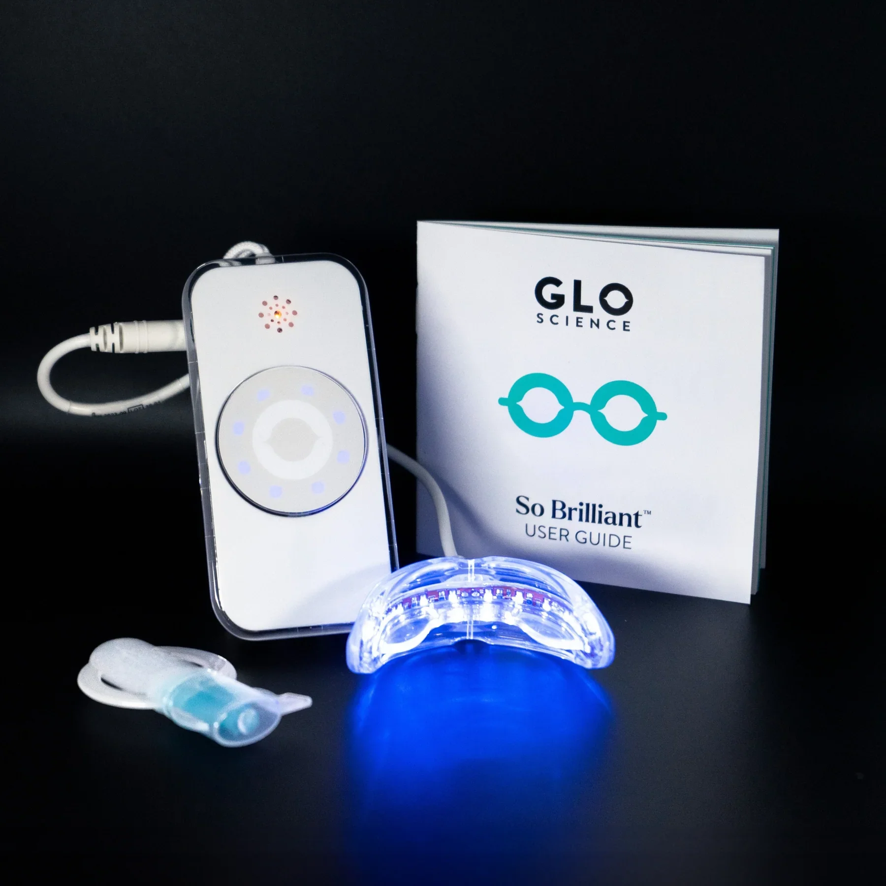
The energetic gradients. take inspiration from Glo’s patented thermo science, Where red to blue lights whiten teeth. These gradients Compliment a core palette of white black and mirror foiling.
All shades are beautiful crafted of 3 colours form our secondary colour palette.
Not only do they create movement and depth, but they help to own each section of our business.We use them whenever we are talking about the relevant product or device.


