@KSS
Liverpool FC
Task Summary
Environmental graphics and wayfinding signage for Liverpool Football Club’s new stadium and training ground.

Branding
-
Environmental Graphics
-
Wayfinding
-
Branding - Environmental Graphics - Wayfinding -

Anfield Mainstand
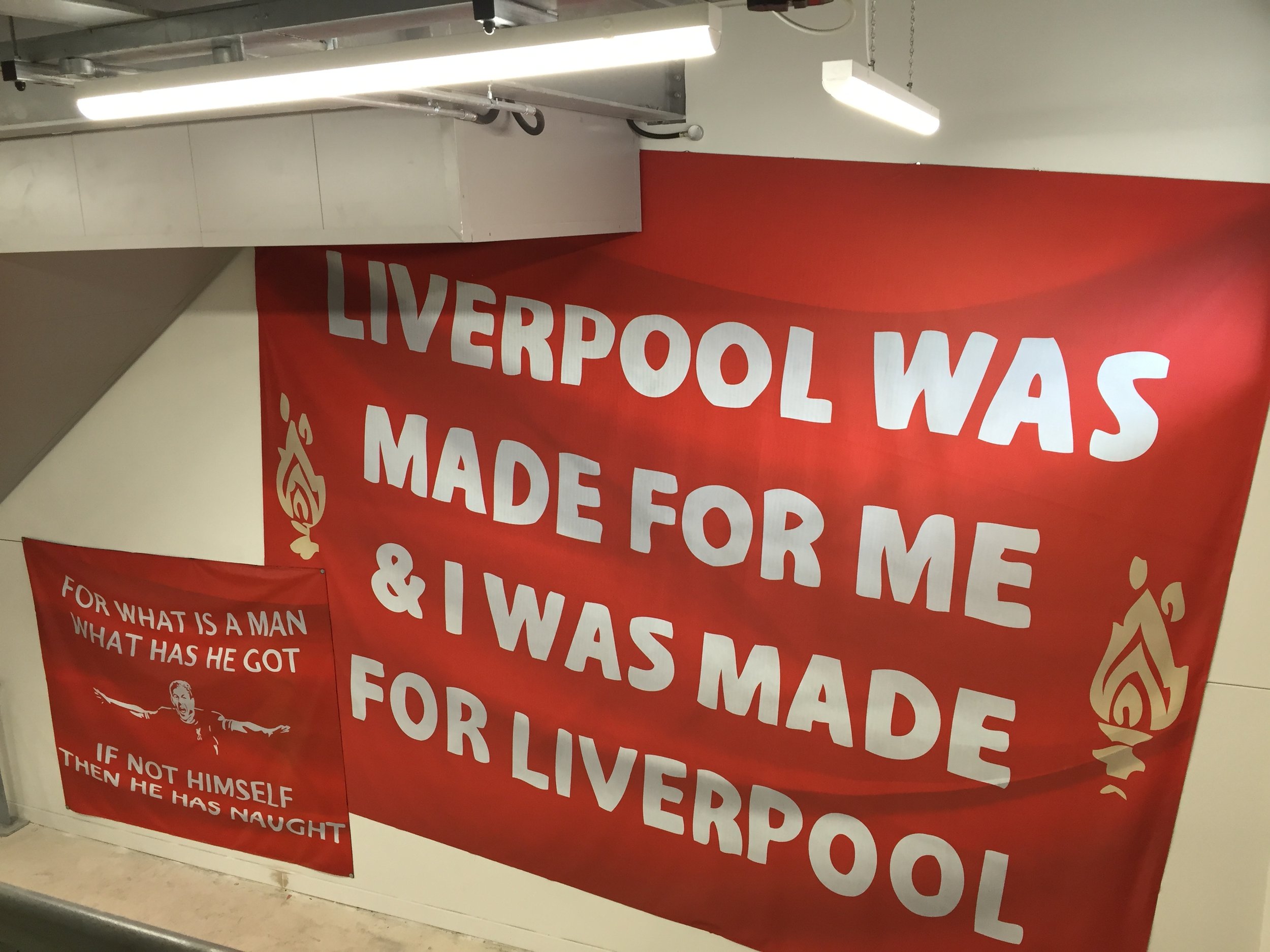
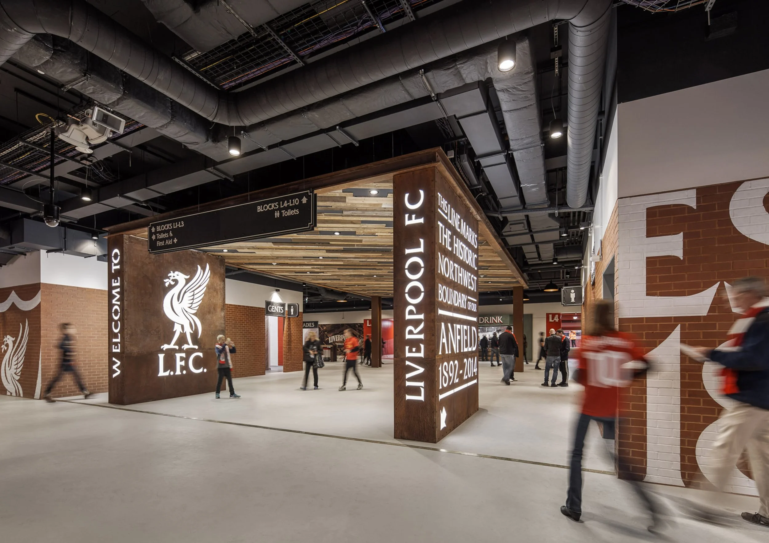
As part of The expansion of Liverpool FC’s Anfield stadium, the spectator concourse designs in the new Main Stand at Anfield celebrate the Liverpool fans and their unique passion for their Club and their City. The artwork takes inspiration from the scarves and flags held high when the Reds are in full flow, and wall graphics throughout the spaces reflect famous moments in the Club’s illustrious history. Materials and colours are inspired by Anfield’s architecture and honour the City’s rich industrial and maritime heritage, and a central seating area in the lower concourse incorporates original timber seats offers a permanent reminder of the 1906 Archibald Leitch stand.
We developed a communication strategy that engages colour, scale, sound, touch and light to ensure a coherent user experience from start to finish. Interweaving the brand through the building and with personalised way-finding


Mellwood Training Ground
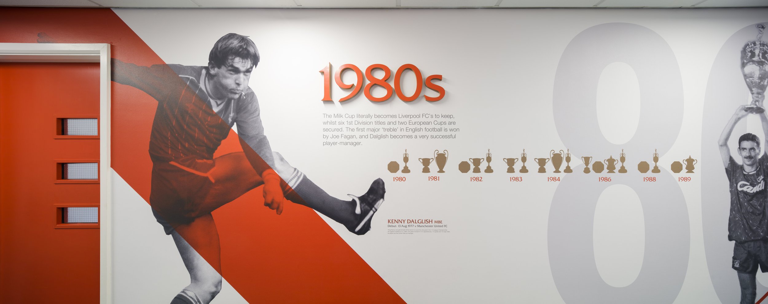
We created large scale environmental info graphics in the corridors as a language to not only educate the players of the clubs history but also motivating them to achieve or to inspire the youth teams.
This focus of continuity for the players was embraced by designing identical locker rooms for the training ground and the stadium. Each locker is personalised using removable name tag header, display shirt and signature graphic. The red tones used are intentionally deeper and richer then the Liverpool brand red in order to give the players shirt graphics more impact. A halo light wash to the perimeter of the timber ceiling and lighting highlights the front of each individual locker module.
We also designed a feature wall with motivational wall statement along the players journey out to the pitches, with hand painted effect text on to existing blockwork also above the lockers.


