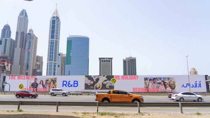
@Dalziel & Pow
R&B

Task Summary
Repositioning apparel brand, R&B, looking at both its visual identity and retail experience for their 100 stores across GCC & India
Brand Identity
-
Signage
-
POS Communications
-
Strategy
-
Art Direction
-
Brand Identity - Signage - POS Communications - Strategy - Art Direction -

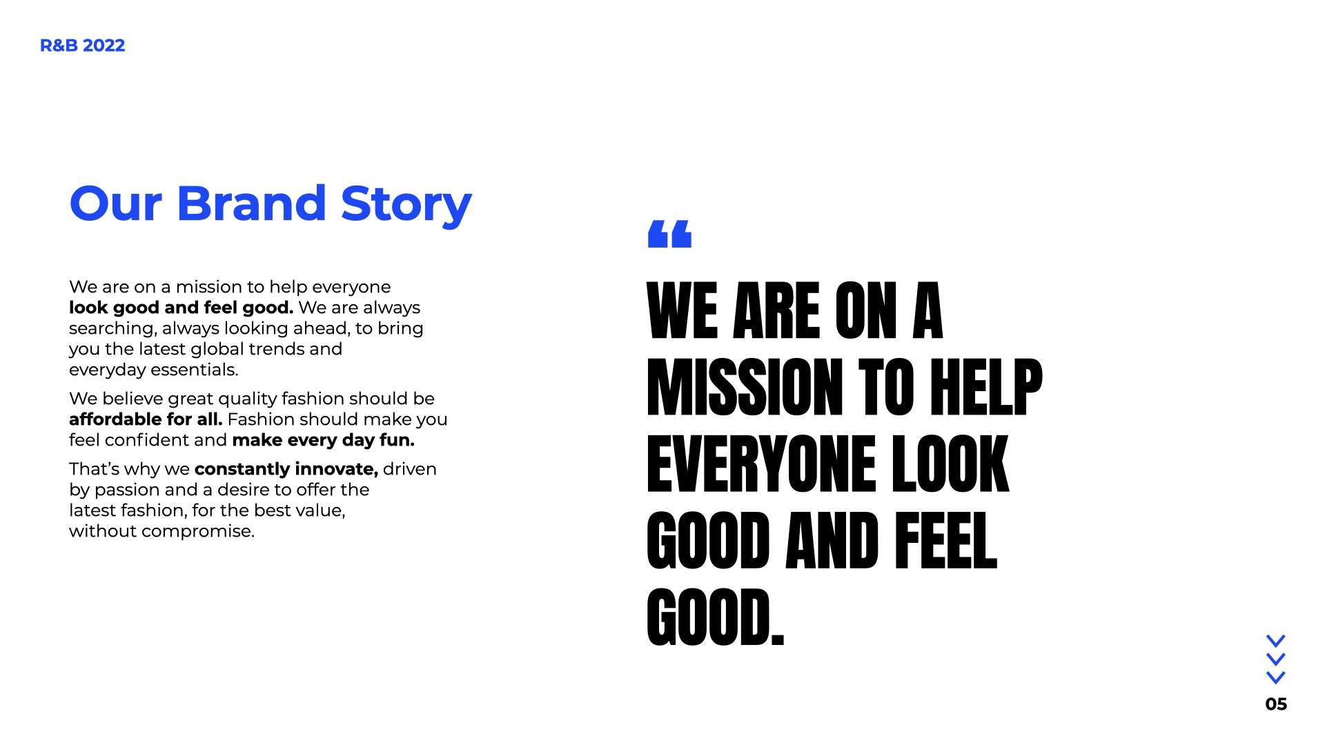
R&B want to become an international, fashion-forward brand with a unique visual language that will be instantly recognisable. Creating an identity that connects with our younger, fashion-conscious demographic.
R&B is a Dubai-based and fast-expanding, fashion brand and retailer. R&B as a brand offers the latest trends and fashions, built on a strong value proposition alongside superior quality. We were tasked to help reposition this brand, looking at both its visual identity and retail experience.
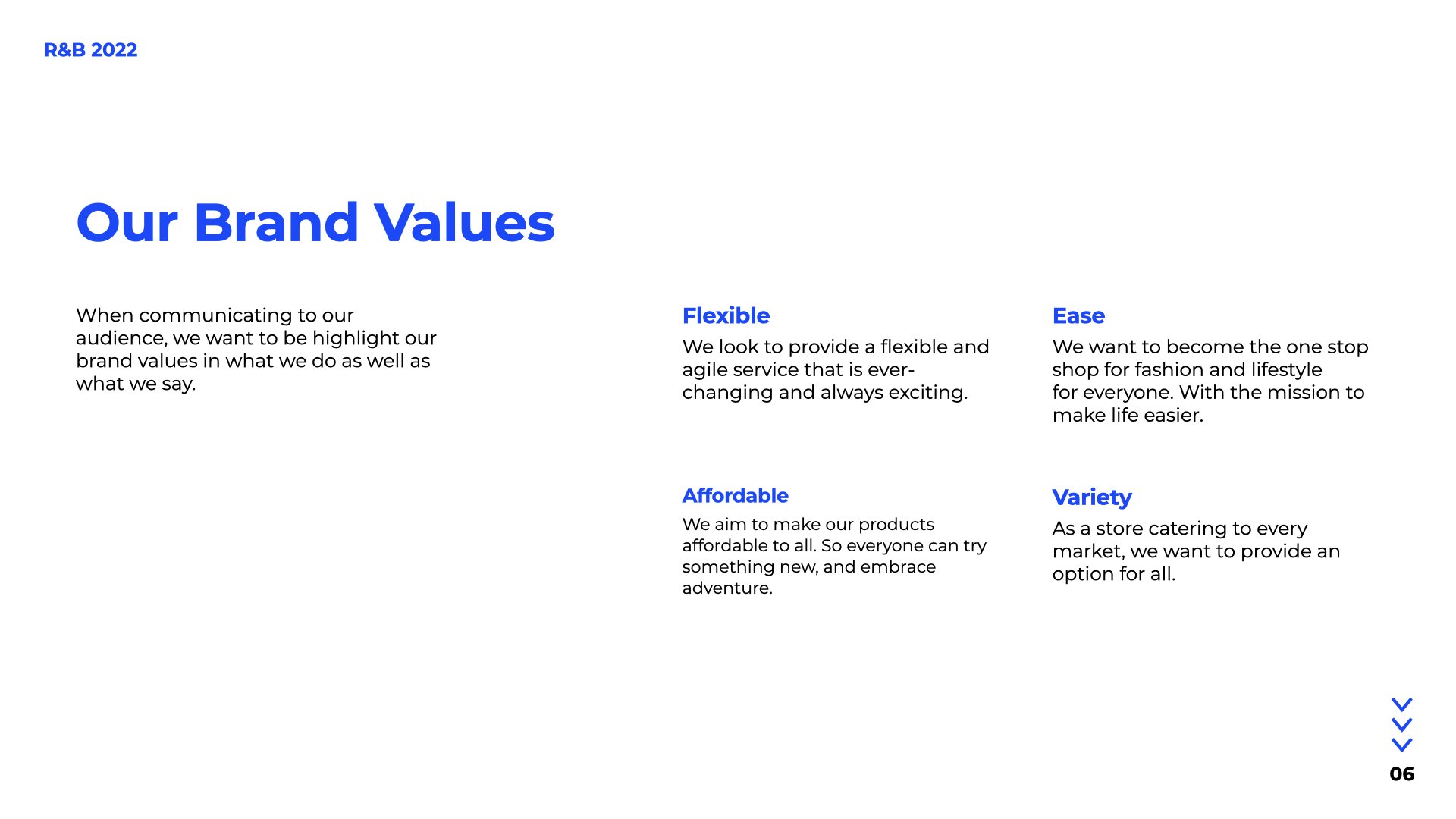
The brand is aimed at the entire family, with an offer that works across the generations. However, a key challenge is differentiation and the ability to stand out in an increasingly crowded market, ensuring their customer knows what the brand stand for, its points of difference, and where it adds value.
We took a deep dive into the global and local fashion market and influences while also unearthing the key differentiators within R&B, to build a new brand positioning, visual identity, and experience.
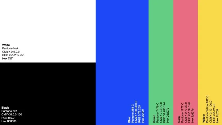
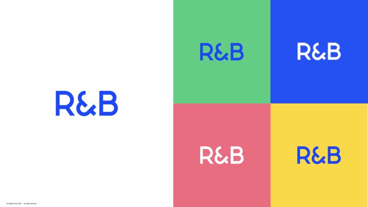
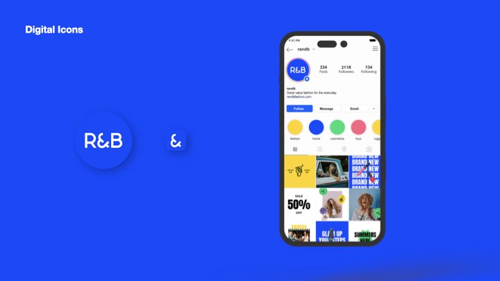
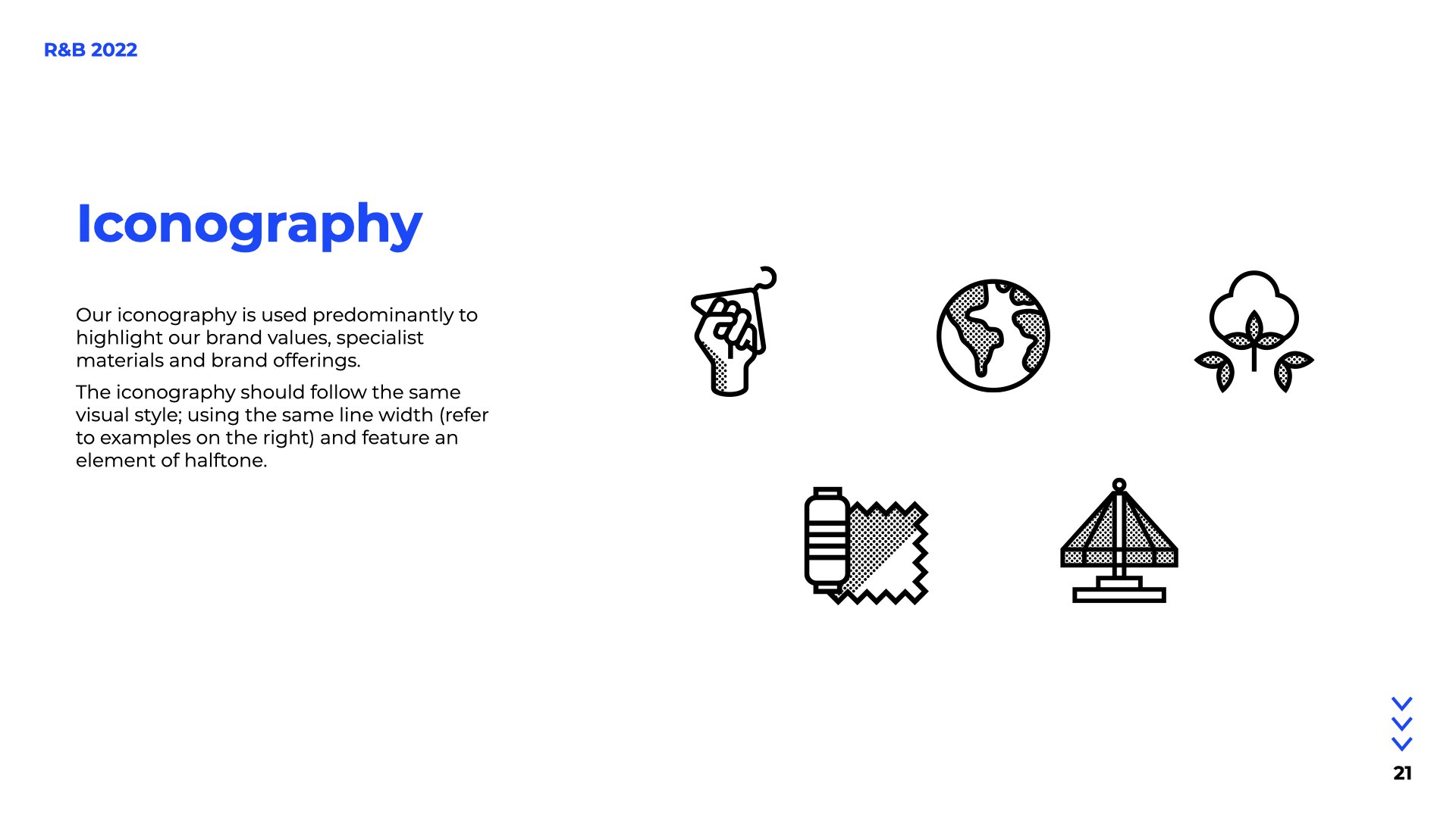
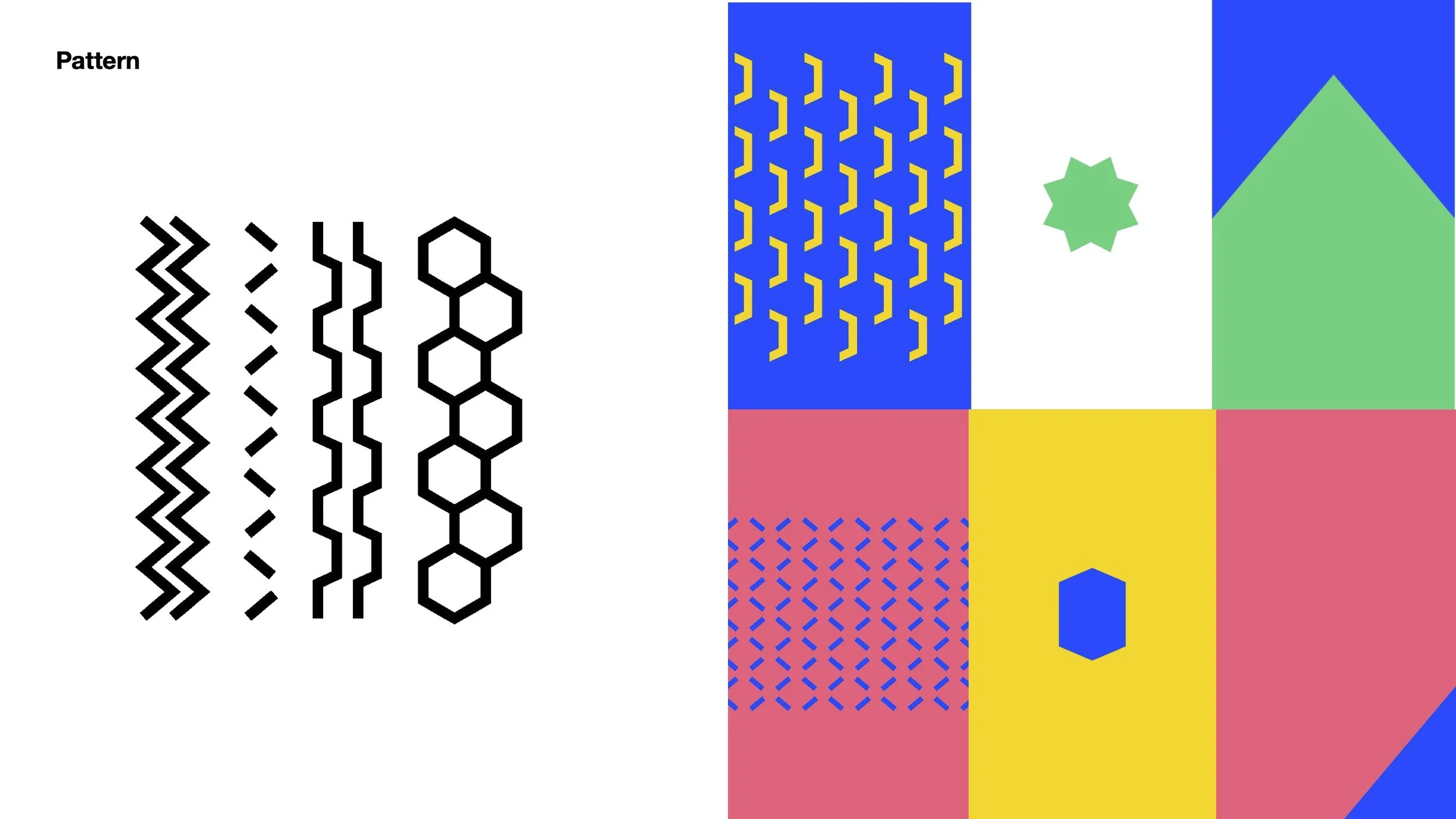
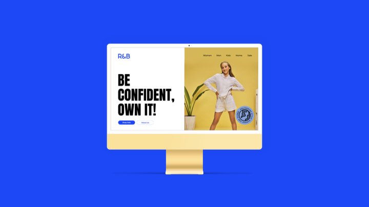
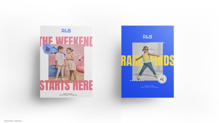
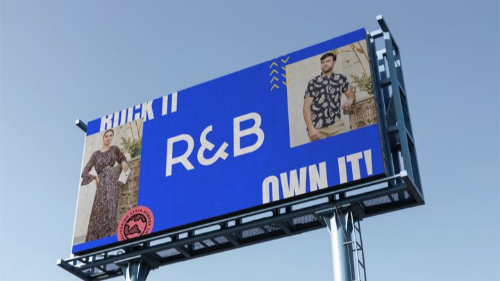
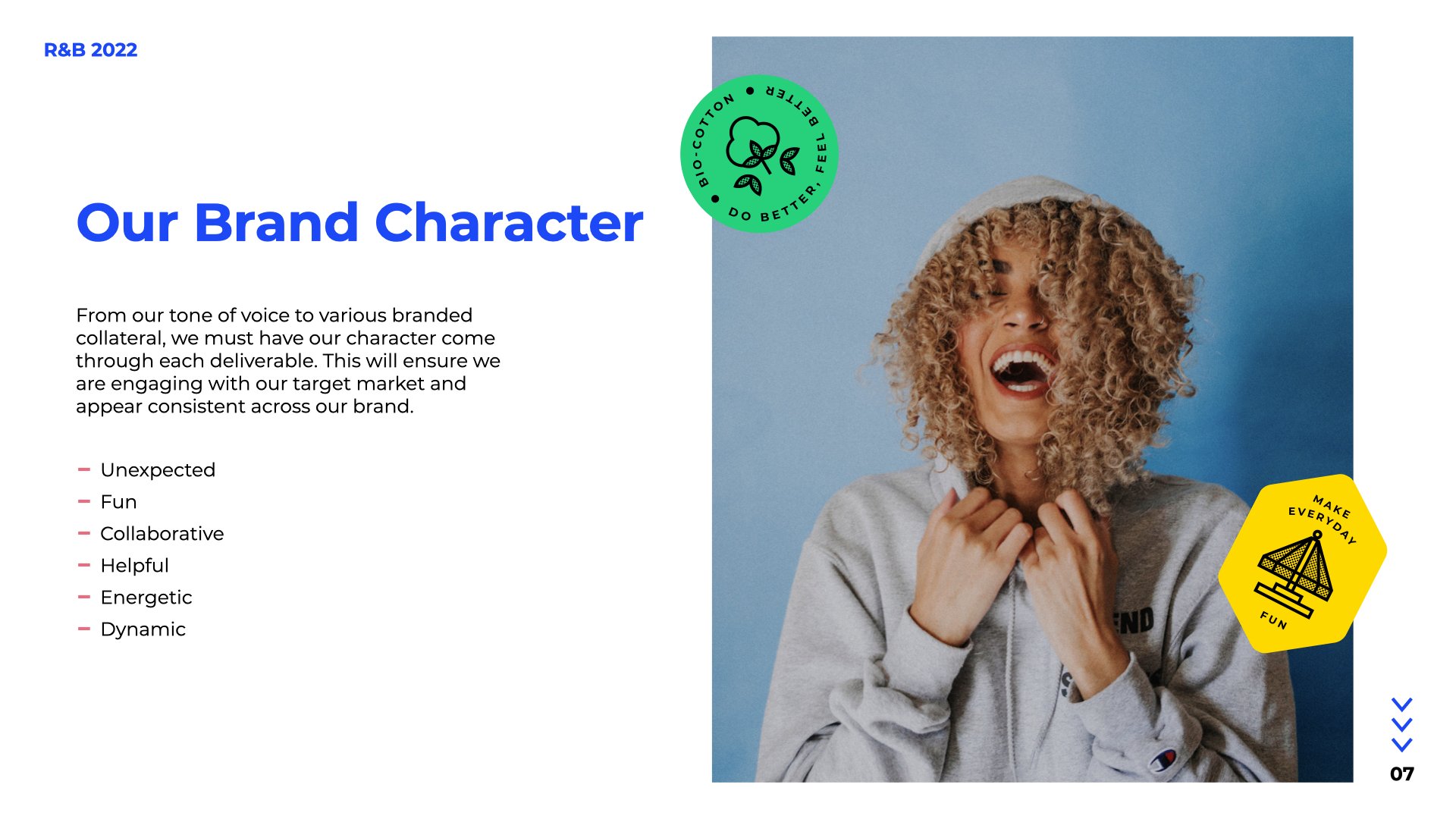
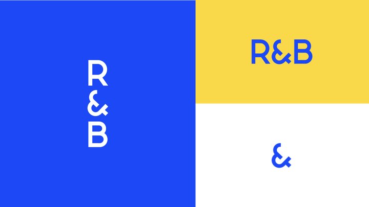
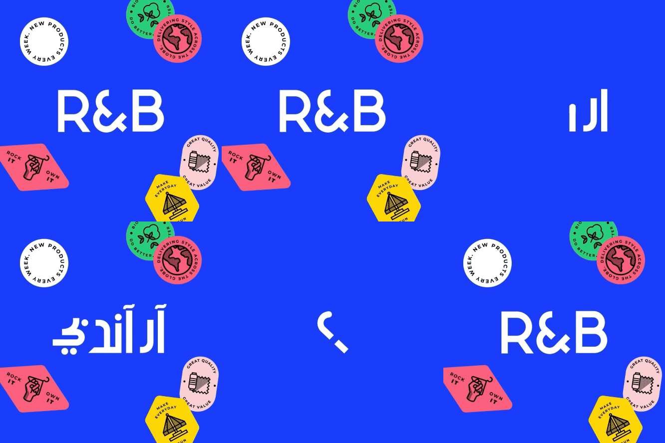
This resulted in a refreshed visual identity, developing a refined logo, bold typography, vibrant colour palette, dynamic brand patterns, product icons and tone of voice to bring energy and constant innovation to the brand language. This sees the creation of a brand that is full of energy, conveys confidence, is bright and positive and most importantly dials up play.
As well as signifying a fashion forward brand, R&B's new logo needed to be consistent across every platform and work equally well in Arabic/English.




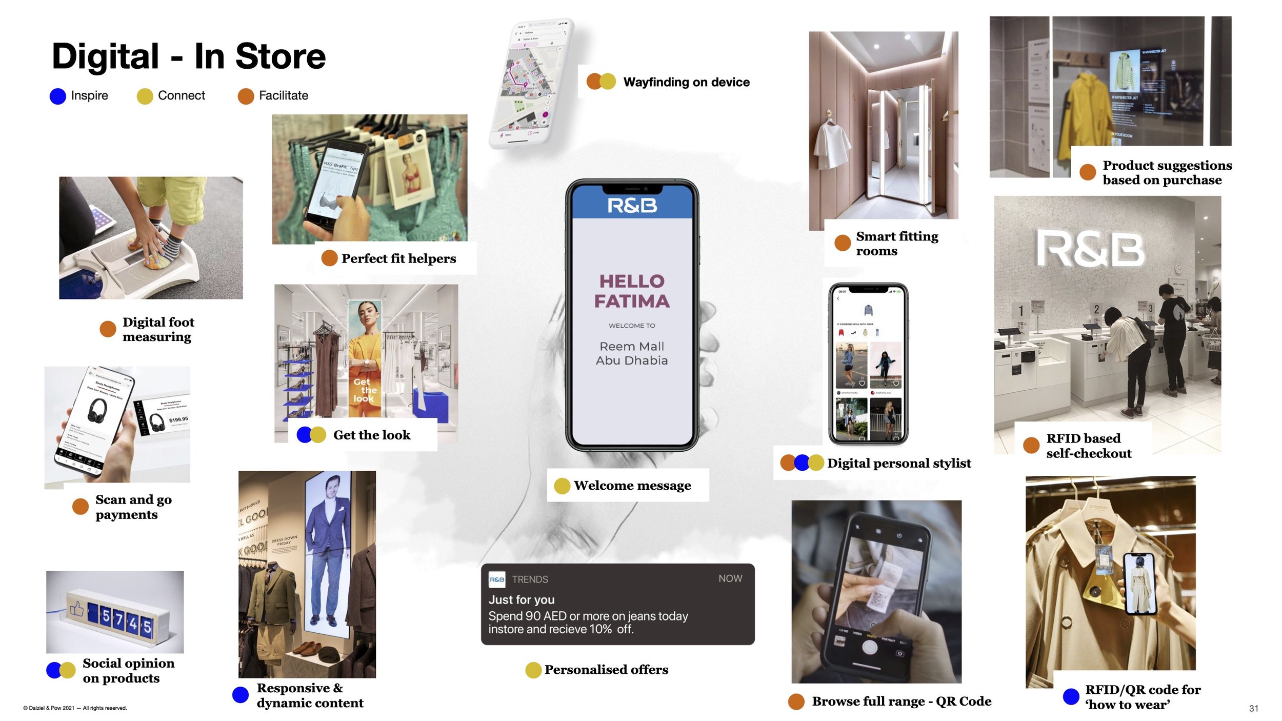
Continuing this new brand energy into store and elevating R&B’s fashionability alongside it’s great value.
One of the things we identified as a key trait of R&B was how the brand never stands still, Its merchandise is always evolving.due to the very reactive nature of their product team to whats trending globally.
We highlighted this by creating. a market place, “The Suok”, in the centre of store. A place thats foreever evolving and creates a focal point for their discovery-driven customers, whilst still elevating its fashionability alongside its great value..
We did this by creating bold market like structure that gives the essence of being always new and encourages customers to grab things while stock last, just a like a traditional souk. Adding to the excitement, the Souk also contains a personalisation stand, a T-shirt vending machine, a photo booth and Pic ‘n’ Mix stand.
We have elevated the brand’s fashion credentials, bringing more joy to the brand, alongside exaggerating its fast moving offer, with a constantly changing and varied product offer that appeals to the whole family.


